Illustrations+ Portfolio
For university to college "reverse-transfer" report.
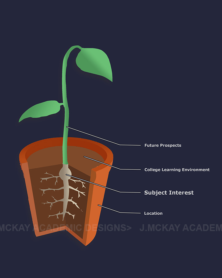
In this illustration my client wanted emphasis the importance of a students chosen subject within the learning environment and the location of the chosen college.
The agreed chosen idea was this one which uses a sapling as a metaphor for the students experiences with these issues.
Get a Quote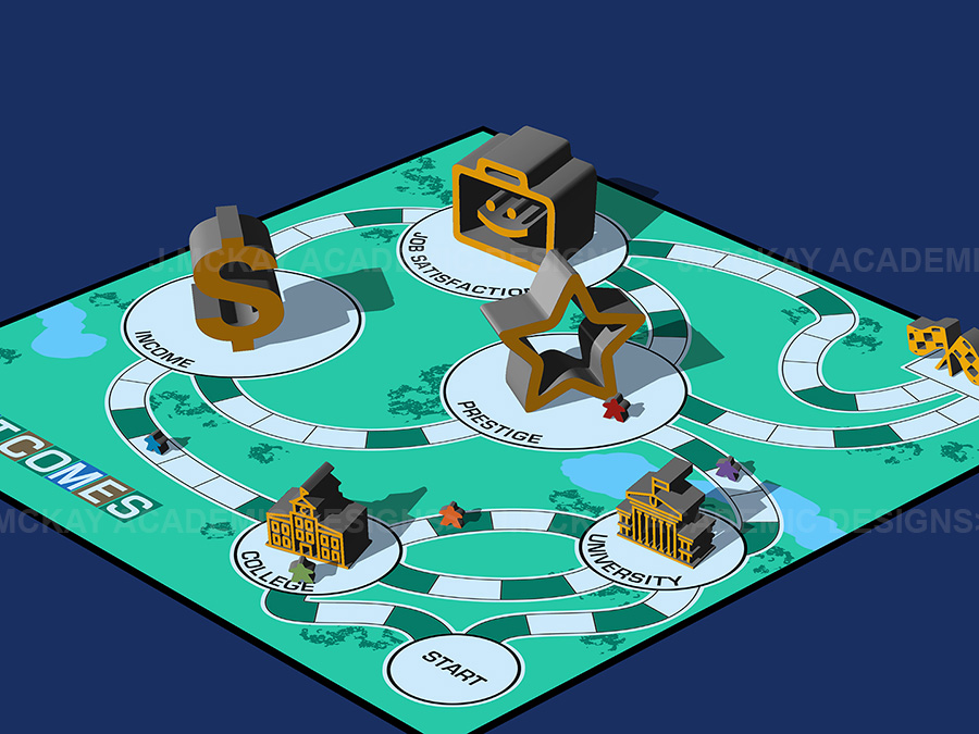
Pathways Illustration
In this case, my clients wanted an image to help illustrate the choices that subjects of the study had as adults.
They agreed to my concept for a board game in which the pieces can be seen to have chosen paths as they move across the board.
Why is this an "illustration" and rather than the "visualization" portfolio?: You are correct that this falls under my definition of a "visualization" because it is based on data. I just wanted to separate a few of these images because they are quite different from the ones in the Visualization Portfolio. It can sometimes be beneficial to take a break from more static information in order to stimulate your audience's imagination and help them see the research ideas in a new light.
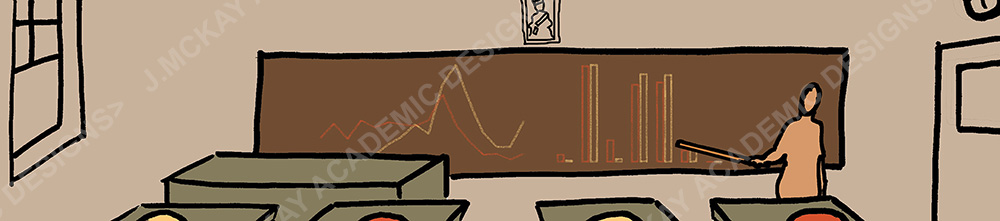
Banner for Webpage
This was created for a website of a 46-year study that began in the 1970s.
To connect it to a 1970s style, I chose a brown/orange monochrome colour palette and a hand-drawn illustration to help convey a warm feeling.
Title Pages
A report requires a title page; let me design one that is more appealing and includes visual cues to the report's visualisations.